
Brand Strategy
The Hidden Psychology of Color in Marketing: Why Your Brand Colors Are Costing You Sales
Your brand color choices affect purchase decisions at a subconscious level. Discover the psychology behind color selection and how strategic color use can increase conversions by up to 24%.

Anirudh Datta
Nov 12, 2025
Two identical e-commerce stores selling organic skincare. Same products. Same prices. Same website layout. Store A uses a navy blue and white color scheme. Store B uses olive green and cream. Store B generates 24% more sales despite identical marketing spend.
Color isn't decoration—it's psychology. Your brand color choices trigger subconscious emotional and cognitive responses that directly impact whether prospects trust you, engage with you, and ultimately buy from you. Most businesses choose colors they personally like instead of colors that sell.
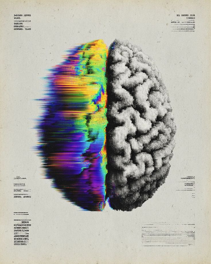
The Neuroscience Behind Color Response
Human brains process color before processing text or shapes. When someone encounters your brand, their limbic system (emotional brain) reacts to color in milliseconds—long before their rational prefrontal cortex reads your value proposition or analyzes your offerings.
This explains seemingly irrational purchase decisions. Someone might choose a more expensive product simply because its packaging color feels more trustworthy or premium. They won't consciously think "I'm buying this because it's blue"—but that's exactly what's happening neurologically.
Different wavelengths of light trigger different neurological responses. Red light actually increases heart rate and creates urgency—explaining why clearance sales and "limited time" promotions universally use red. Blue light triggers calming responses and trust associations—explaining its dominance in banking, healthcare, and technology branding.
Cultural context shapes color meaning. In Western markets, white represents purity and cleanliness—ideal for medical and wellness brands. In many Eastern cultures, white symbolizes mourning and death—disastrous for those same brand categories. Global businesses must consider cultural color interpretations carefully.
What Each Color Psychologically Communicates
Red signals energy, urgency, and passion. It's the only color proven to increase heart rate and blood pressure. Fast food brands (McDonald's, KFC, Wendy's) use red because it stimulates appetite and creates urgency. Call-to-action buttons in red consistently outperform other colors in A/B testing—though context matters.
Blue builds trust, security, and professionalism. It's America's most-liked color and the safest brand choice for businesses requiring trust—banks, insurance, healthcare, technology. According to research in neuro-marketing, blue reduces perceived risk and increases willingness to engage with financial services.
Green represents growth, health, and natural/organic products. Whole Foods, Starbucks, and nearly every organic brand uses green for obvious reasons. It signals environmental consciousness and health benefits. Our Volgrow team has seen wellness businesses increase conversion rates 12-18% by shifting from blue to earthy green color palettes.
Yellow creates optimism and energy but can overwhelm when overused. It's excellent for accent colors and CTAs (think "add to cart" buttons), but dangerous as a primary brand color. Too much yellow creates anxiety and eye strain. McDonald's uses red and yellow together—yellow for optimism, red for urgency.
Orange combines red's energy with yellow's friendliness. It signals affordability and approachability—explaining its popularity in budget brands (Home Depot, Nickelodeon, Amazon). Orange CTA buttons often outperform red in industries where urgency feels pushy.
Purple signals luxury, creativity, and wisdom. Historically expensive to produce, purple remains associated with premium positioning. Luxury brands (Cadbury, Hallmark, Crown Royal) use purple to signal quality and exclusivity. In tech, purple suggests innovation and imagination (Twitch, Yahoo).
Black and white represent sophistication, timelessness, and minimalism. Luxury brands (Chanel, Prada, Apple) leverage black for its association with elegance and high-end positioning. Overuse creates cold, impersonal feelings—balance is critical.
Strategic Color Application for Maximum Conversion
Your primary brand color should reflect your core brand attribute. If your main competitive advantage is trustworthiness, blue serves you well. If it's energy and boldness, red works. If it's natural/organic positioning, green makes sense. Don't fight color psychology—leverage it.
Secondary colors provide versatility and depth. A brand using navy blue as primary might add coral or gold as secondary accents. This combination maintains the trust of blue while adding warmth and approachability. Strict monochrome limits your communication range.
Call-to-action buttons should create contrast, not match your color scheme. If your site uses blue, your CTA buttons shouldn't be blue—they'll blend in. Orange or red CTAs on blue backgrounds create visual pop that draws the eye and increases clicks by 15-25%.
Background colors affect readability and engagement more than most businesses realize. Dark text on light backgrounds reduces eye strain and improves reading comprehension. Light text on dark backgrounds creates premium feelings but reduces readability—use strategically for headlines, not body text.
Industry-Specific Color Strategy
Healthcare and medical businesses should prioritize blue (trust and cleanliness) with green accents (health and wellness). Avoid red (associated with blood and danger in medical contexts) except for emergency services. White space is your friend—communicating cleanliness and professionalism.
Food and beverage businesses benefit from warm colors—red and yellow stimulate appetite while orange suggests affordability and fun. Coffee shops use earthy browns and greens to signal organic and artisanal qualities. Fine dining uses black, gold, or deep burgundy for luxury positioning.
Financial services demand trust above all else—explaining the dominance of blue and sometimes green (growth/money). Avoid orange and yellow, which signal budget brands incompatible with financial seriousness. Small amounts of gold or silver accent colors add prestige.
Retail and e-commerce need careful color strategy by category. Discount retailers use bright, energetic colors (red, orange, yellow). Premium retailers use black, white, and metallic tones. Target's red bulls-eye combines affordability (red/orange) with design sophistication (white space).
Technology and SaaS companies default to blue so consistently it's almost cliché—yet it works because it signals reliability and innovation simultaneously. Purple and green provide differentiation while maintaining tech-friendly associations. Avoid brown and beige, which feel outdated in tech contexts.
Color Combinations That Work
Complementary colors (opposite on color wheel) create vibrant contrast—blue and orange, purple and yellow, red and green. This high contrast draws attention and creates energy. Use for CTAs and important elements requiring immediate notice.
Analogous colors (adjacent on color wheel) create harmony and sophistication—blue and green, red and orange, purple and pink. This creates cohesive, pleasant experiences ideal for brand foundations. Less dramatic but more sustainable for extensive viewing.
Triadic colors (three colors equally spaced on color wheel) offer balanced vibrancy. Red, yellow, and blue provide energy without overwhelming. Requires skill to execute without looking childish—works better for playful brands than professional services.
Monochromatic schemes (different shades of one color) communicate simplicity and elegance. Varying darkness/lightness of blue creates sophisticated, focused branding. Can feel limiting but works beautifully for minimalist brands.
Common Color Mistakes Killing Conversions
Using too many colors creates visual chaos. Your brand should have 2-3 primary colors maximum, with perhaps 1-2 accent colors. Websites using 6+ colors feel unprofessional and overwhelm visitors. Research shows limiting color palettes to 3 colors increases brand recognition by 80%.
Choosing colors you personally like instead of colors your target audience responds to kills conversion. Your personal preference for purple doesn't matter if your audience is middle-aged men seeking financial services—who statistically prefer blue and associate purple with feminine products.
Ignoring accessibility alienates 8% of male customers with color blindness. Red-green color blindness is most common—avoid relying on red versus green to communicate critical information. Use text labels, icons, or patterns in addition to color coding.
Following competitors' color choices mindlessly creates category confusion. If every Italian restaurant in Chicago uses red-and-white checkered patterns, yours might need different colors to stand out mentally. Strategic differentiation beats category conformity.
Testing Color Impact
A/B test CTA button colors systematically. Test red versus orange versus green buttons on identical landing pages. Track not just click-through rate but actual conversion rate—sometimes higher clicks don't equal higher sales if color creates wrong expectations.
Test primary brand colors using Facebook ads. Run identical ads with different color variations to small audiences. Measure engagement rate, click-through rate, and cost per conversion. The color variation performing 20-30% better should inform your brand palette.
Survey existing customers about brand perception. Show different color variations and ask which feels most aligned with descriptive words—trustworthy, innovative, affordable, luxurious, friendly. Customer perception data trumps designer opinions.
Monitor heat maps to see if color directs attention effectively. Do visitors' eyes naturally move to your CTA buttons? Do they focus on key selling points? If your color strategy fails to guide visual attention, it needs adjustment.
The 60-30-10 Rule
Professional designers use the 60-30-10 proportion rule. Your dominant color should appear approximately 60% (backgrounds, major sections). Your secondary color should be 30% (secondary sections, large elements). Your accent color should be 10% (CTAs, highlights, important details).
This balance creates visual interest without overwhelming. All-blue websites feel monotonous. Evenly split blue-orange websites feel chaotic. A 60% blue, 30% white, 10% orange website feels balanced and guides attention strategically.
Real-World Impact
When our team at Volgrow helped a Minneapolis law firm shift from traditional navy blue to a distinctive charcoal-and-teal palette, their consultation request rate increased 28% without changing messaging or site structure. The color shift differentiated them from competitor firms while maintaining legal professionalism.
A Miami-based meal prep service switched from generic green (like every health food brand) to an unexpected burgundy and cream palette. Their premium positioning became instantly clear, allowing them to raise prices 15% while actually increasing customer acquisition. Color communicated value before customers read a word.
Your brand colors work 24/7, influencing thousands of micro-decisions in prospects' subconscious minds. Choose strategically based on psychology and testing rather than personal preference, and watch those invisible psychological influences become very visible sales increases.


